Welcoming our Risograph machine to the studio has been one of the single most exciting things to happen on this adventure!
I have always admired the look and feel of the Riso print. The way the ink sets into the paper, the bright colors, the way they overlap. When I was introduced to the Riso for the first time, due to my background in screen printing, it was easy for me to understood how it works, and I've been experiencing what it's similarities and differences are. Adding this new process to our studio has been really exciting both for our own printing process and workshops!
Read on to learn more about our Risograph, and why it's awesome.

^ Me loading our coral ink drum into the Riso. It can print one ink color at at time.
The color possibilities are wonderful. For the longest time, I thought it only printed in certain colors, like fluorescent pink and cyan. Once I heard of the more unique ink colors available, the door was swung open. That is honestly what really sealed the deal for me. Being able to print in colors that are similar to what I usually gravitate toward, such as sunflower, coral, and bright olive, made me excited. And not only that, but I could see ways of bringing risography into our studio process and Worthwhile collections.

Spontaneous freedom and experimentation! I really enjoy the 'making' part of making things, so being at the helm of the printing process is really fun for me. I like being in the zone, actively troubleshooting, and physically involved in the making, which is usually not the case for all of the work we do for Worthwhile (I am not typically the person who does the screen printing). It just feels good and freeing to know that in addition to our well-established screen printing process, I also have the option of experimenting on a total whim, or making new things when our screen printing production schedule is packed.

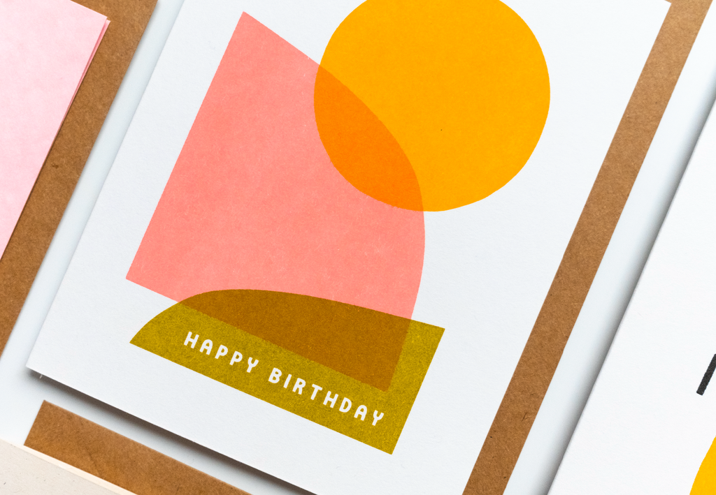
^ Our colorful card collection of 6 Risograph cards for early 2023 focuses on springtime occasions such as Mother's day, cute lil babies being born, and spring-infused thanks and birthdays.
So, wait, what is a Risograph, you ask? A Risograph is a stencil-based printer. Just like screen printing, one later is printed at a time. But unlike screen printing, this process happens inside of a machine. When I tell my friends about it and then they come look at it they are really surprised that it doesn't look like a super dazzling and artsy print-making setup - it looks like a xerox machine from the 80s! But just like most things, it's what's on the inside that counts.
The Risograph prints with a unique process. Each layer of the design is printed individually using bold and vibrant inks through big color cylinders that rotate and press onto the paper. The resulting print sort of looks like letterpress, but without the emboss.
And it's one of the most eco-friendly printing methods available. The best part of the aforementioned deliciously colored inks is that they are plant-based and non-toxic. Risograph inks are made from soy and/or rice bran, which are printed through a rice paper stencil inside the machine to create tactile prints with minimal impact on the environment. In addition to the environment-friendly inks, the machine uses minimal amounts of heat and electricity, making it one of the most sustainable printing methods available.
Risograph has an interesting history. The artistic and technological origins trace back to Japanese stencil-making and print-making innovations that value detail and precision. There is a pretty rich art history to unpack in addition to the commercial history, but to keep it simple, the Risograph as we know it today has its origins in the 1980s marketed for office use and high-volume printing. Once squeezed out of that market by Xerox, there has been a creative renaissance over the last decade or so. Artists and designers, swooning over the gorgeous texture and handmade aesthetic, have brought Risograph printing to new horizons and unexpected, exciting creative uses have emerged.
Risograph prints have this beautiful tactile texture to them, and the inks are rich and matte, and they sink into the paper. It’s really beautiful. They have a certain charming imperfectness to them that I love. Quirky, yet wholesomely artful and gorgeous.
Fun design possibilities. Unlike screen printing, designs can incorporate value on one color layer, meaning I can print one color layer in varying degrees of opacity. Below I had my coral layer set to 90% opacity for the dark pink, and 60% opacity for the lighter pink.

Needless to say, there has been a lot of me squealing about how I can’t believe I haven’t opened this door sooner. I'm looking forward to many new possibilities and inspiration. I have a vision for an analog abstract art print workshop using only cut paper shapes and the risograph where everybody swaps prints at the end. Or a riso-your-own-valentines event. (Edit: since this post was written, both of these visions have come true!)
I still have so many ideas! Limited edition small runs! Printing for friends and the community! Collaborations! And of course, more Worthwhile cards and prints.
I hope you enjoyed reading about our new Riso. I hope you love what we are making on it, and sign up for a workshop or 1:1 Riso immersion!